

After months of mockups, code, persistently broken layouts, and more browser tabs than we'd like to admit, The Ubyssey's digital home has a new face.
The Ubyssey's online presence began when the first version of our website went live in the late 2000s, back when the internet was still mostly made of hopes, dreams, and questionable web design. Almost 20 years later, we're introducing a refreshed ubyssey.ca.
Over nearly two decades, our website has evolved and transformed alongside the newspaper itself. New sections were introduced; some were later removed; different story formats were tested by time; visual identities shifted; and new features were added as the needs of the newsroom changed. Many of those versions solved a problem at a particular moment, but they also caused more to accumulate over time. Pages that were built in different eras began to follow distinct visual rules and newer features often had to coexist with structures designed years earlier. Rather than feeling like one publication, parts of the website were forming what can only be described as disparate snapshots of different moments in The Ubyssey's digital history.
That history was still visible in the experience of using the website. Important stories that showcase our journalism were often difficult to discover beyond the homepage, sections and their respective beats did not always feel connected to one another, and important information about what The Ubyssey itself is would be buried several clicks deep. The goal of our redesign effort, then, was to step back and reconsider how readers moved through the site and interacted with our journalism, and what we would like that experience to be in order to better reflect what we strive to achieve as a publication today.
We experienced at least four crucial realizations during the redesign process. The first came when we were still operating at the wireframe level, translating our print product's spatial relations into different web possibilities. Vexed with questions like whether we should have three, four, or five columns and how generous we should be with margins and gutters, we returned to an essential question we had been overlooking: how many stories are we actually going to publish each day?
We wanted the homepage to be our flagship digital destination. Switching from continuous to edition-based publishing last September helped: rather than publishing whenever a story was ready — at any hour — we switched things up to only publish at midnight each night, every day except Sunday. Inspired by the ritual of a daily newspaper delivered to a reader's doorstep, we gave you a reason to visit the homepage by reserving publishing for midnight and midnight only.
With a year of experience already doing this, we knew we'd be publishing three to five stories a day, assuming we have the volunteer staff to report that — which we wouldn't really have until October. We also knew the range in visual rhetoric and time regimes our stories spanned, and we knew roughly what proportion of features, enterprise stories, live blogs, reviews, and paradigmatic bread-and-butter news reports we'd need ubyssey.ca to handle. That dramatically narrowed our potential sources of inspiration for the home page. Broadcasters like the CBC and major newspapers like the New York Times or Globe and Mail were out — they don't publish on daily edition cycles because that's too infrequent for following developments down to the minute.
As readers of those publications, we know their geographic and editorial range is enough to warrant a visit whenever we want. The Ubyssey doesn't promise that — and neither do outlets like the Columbia Journalism Review, The Tyee, New York Magazine's Intelligencer, New York Review of Books, Xtra, and Maclean's. These five websites formed our shortlist for inspiration, not because of their traditional, newsmagazine aesthetics (that was a necessary condition, but not a sufficient one) but because of their ability to order comparable volumes of new stories on a daily publishing rhythm.
Slowly, the new design got further and further away from our old one. Every week, we would look at the most recent mock-up together, scroll through the homepage, figure out which additions we liked and what still wasn't working. The first few drafts looked a lot like our old website — every change was minor. A different blue, a different font. It took us awhile to realize how different from the original we could make it.
Taking inspiration from physical newspaper clippings, we started taking and cropping screenshots of each of the sites and playing around with how different elements might fit together. The first mock-up of a three-column ubyssey.ca homepage was essentially a collage of the NYRB's navigation bar on top of CJR's cover stories on top of a few more elements from Maclean's and the Intelligencer. It was through fitting the different elements together and seeing how they clashed that ubyssey.ca's print-evoking, symmetric, holy grail layout emerged.
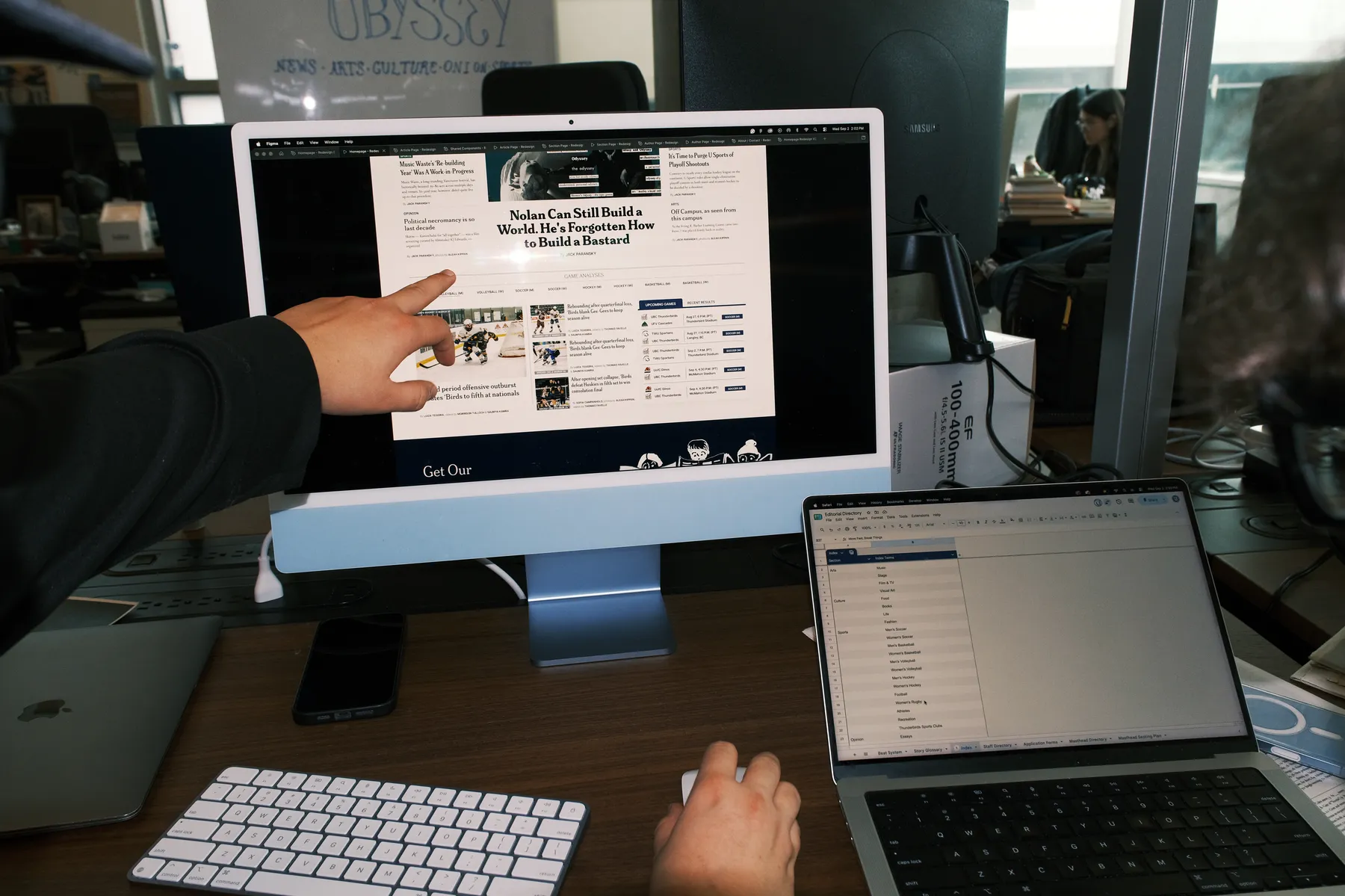
Once we created our first completely original mockup, we came up with new terminology to describe the hierarchy we were creating by continuing the print metaphor. The "above the fold" section of our website is everything you see immediately when you visit the homepage. It's five stories — one cover story and four sidebar stories — and our navigation bar, which was inspired by Spencer's habit of visiting The Tyee's website between 9 and 10 p.m. each weekday to see the next day's stories. Having been a daily reader for more than half a decade, he knows The Tyee publishes during that window, and he knows exactly where to look for differences on The Tyee's website.
We wanted to create the conditions for the same habits with ubyssey.ca. We were also inspired by journalist and political theorist Walter Lippmann's words in Public Opinion, where he wrote that all news has its origins in the banal until a moment of "manifestation" gives events "a shape that can be reported." This early work of media studies gave us a philosophy of user experience to work with, and we designed the homepage to guarantee a moment of manifestation with every marginal contribution to our report. Practically, this meant concentrating attention on a small area of five cards (one main, two in each sidebar) where we could be sure at least one new story, and at most five, could appear each day.
Like any design project, typefaces can make or break the entire endeavour. We knew how to use our headline typeface, Meursault, in print, but we weren't sure when to use its 72 variations above the fold. Everything we tried looked cool at first and weird five minutes later. We tried adjusting the line spacing and weights; cutting decks and creating longer decks; working with shorter headlines (we're well aware Ubyssey headlines are far too long — we're learning to write better ones). But nothing seemed to work.
Because we initially copied our type settings directly from InDesign files used for print editions, we unknowingly set mock headlines in title case, where every word was capitalized. That looks great in condensed variants of Meursault, which we use for shorter stories with immediate relevance, but is an outrageous choice to accompany what media sociologist Gaye Tuchman would call nonscheduled news (features and profiles, generally) and more subjective stories like those published in Arts and Opinion.
In a non-technical sense, the vibes were off, and we didn't even think about the letter case until several weeks into the homepage redesign. We experimented with sentence case, capitalizing only the first word in the headline and proper nouns, and instantly ran into the same problem in reverse when we applied it in an extended variant of Meursault. It looks great for most Arts and Opinion stories — the nonscheduled ones — but it associated the entirely wrong sense of urgency with breaking stories and anything readers needed to know about now.
So, we went with both.
Going into the redesign, we knew we wanted to have access to all variants of Meursault whenever we edited the homepage. We use it because it's a variable typeface. Developing case-sensitive editorial design practices justified using Meursault across our report's entire story form spectrum. It made it look normal for us to write headlines for live updates and in-depth profiles in the same typeface.
When applying different fonts, we consider a story's form, timeliness, and the different responses evoked by its headline in relation to all other above-the-fold stories to decide whether to go extended or condensed, and to what degree. There are no rules, only principles.
That took care of the above-the-fold section. The below-the-fold section still needed to be developed.
At first, we automatically started creating mock-ups that ordered the below-the-fold by section. This was already a fraught assumption; for years, non-News section editors had grumbled about recent stories from their section being placed lower on the homepage than those of their counterparts, ostensibly for little reason.
In one of our meetings, Sophia questioned the wisdom of ordering by section at all. If people want to navigate by section, they can use the navigation bar to perform that filter, which we already wanted our new design to promote. Why give multiple options when a single good one is already available? From then on, the algorithm for the below-the-fold became the 10 most recently published stories not currently published above-the-fold. In that simplicity, we found freedom. And it made everything look so much better.
The section page layouts, new navigation bar and extended bylines came to life during many conversations about who our readers are and what they need from our design. These elements are completely unique to us, but they're inspired by our references and research in the way that everything else is. Taking inspiration from them means understanding what about their design works for their readers and publication style, and how we can apply that logic to best fit ours.
Design has a complicated relationship with reference. People unfamiliar with the practice might warn against "copying" and novice designers tend to lean too heavily on singular, canonical pieces. This creates a cyclical reproduction of what already exists; it stifles innovation by discouraging critical engagement with reference. All visual outputs become homogenized and nonsensical.
Good design demands lots of inspiration, good designers study what is already out there. They build on people's pre-existing associations with typographical elements, colour, and layout to communicate with their audience. The design of our new website is informed by many others, and, more fundamentally, an understanding of our publication and its purpose.
The grid system, navigability, content-suited typography and a sense of the periodical as its own domain of knowledge and conditions of production became the basis on the entire design process. We wanted a website that shared how we think about our journalism. We found our voice by finding a formula and an unabashedly Ubyssey sense of sociotechnical judgment in editorial design.
Early in the design process, João Pedro talked about us creating a comprehensive design language for The Ubyssey's products. We took the metaphor seriously, but found the fun and freedom not in lexicon and prose, but in our renewed aesthetic grammar and the combinatorial logic it afforded.
We did this by reading, learning from each other, and by sitting down at our desks (together and separately) for hours on end. That's it. No AI and no templates.
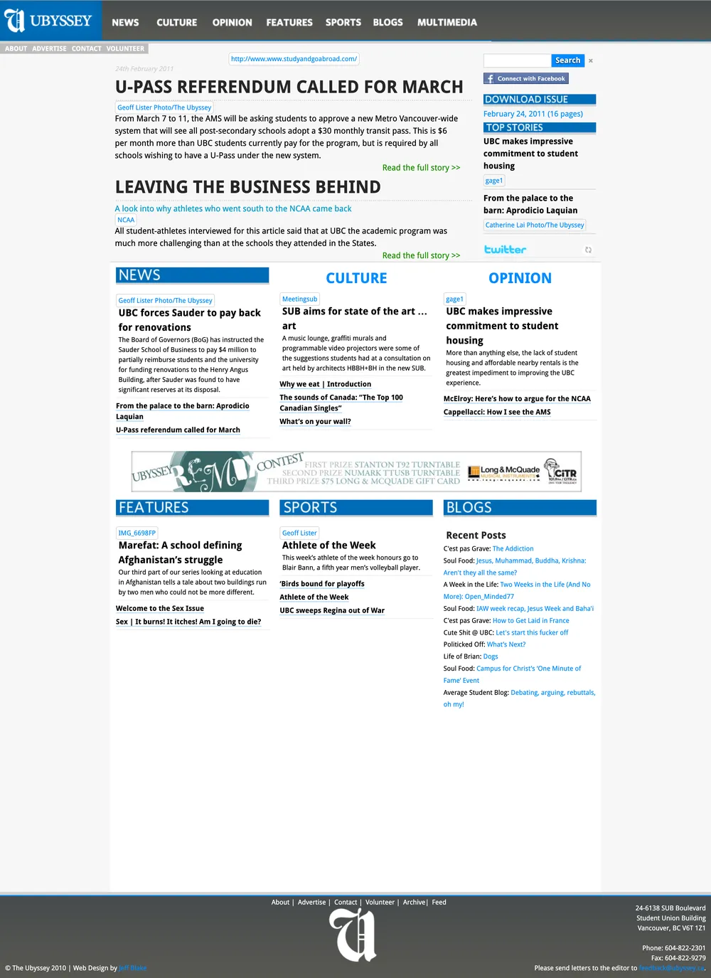
Earliest homepage of ubyssey.ca that can be retrieved today, published in late 2010.